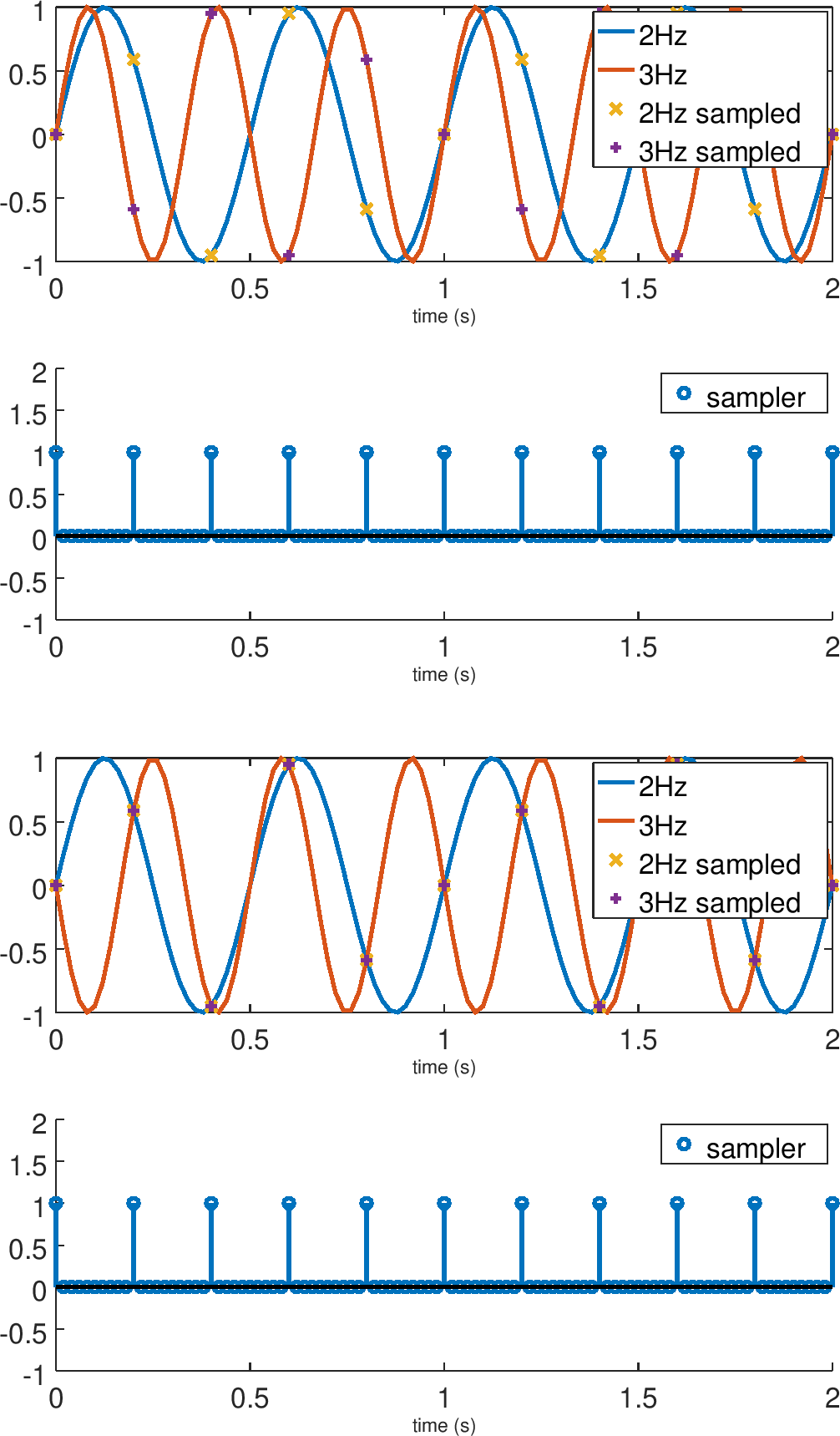
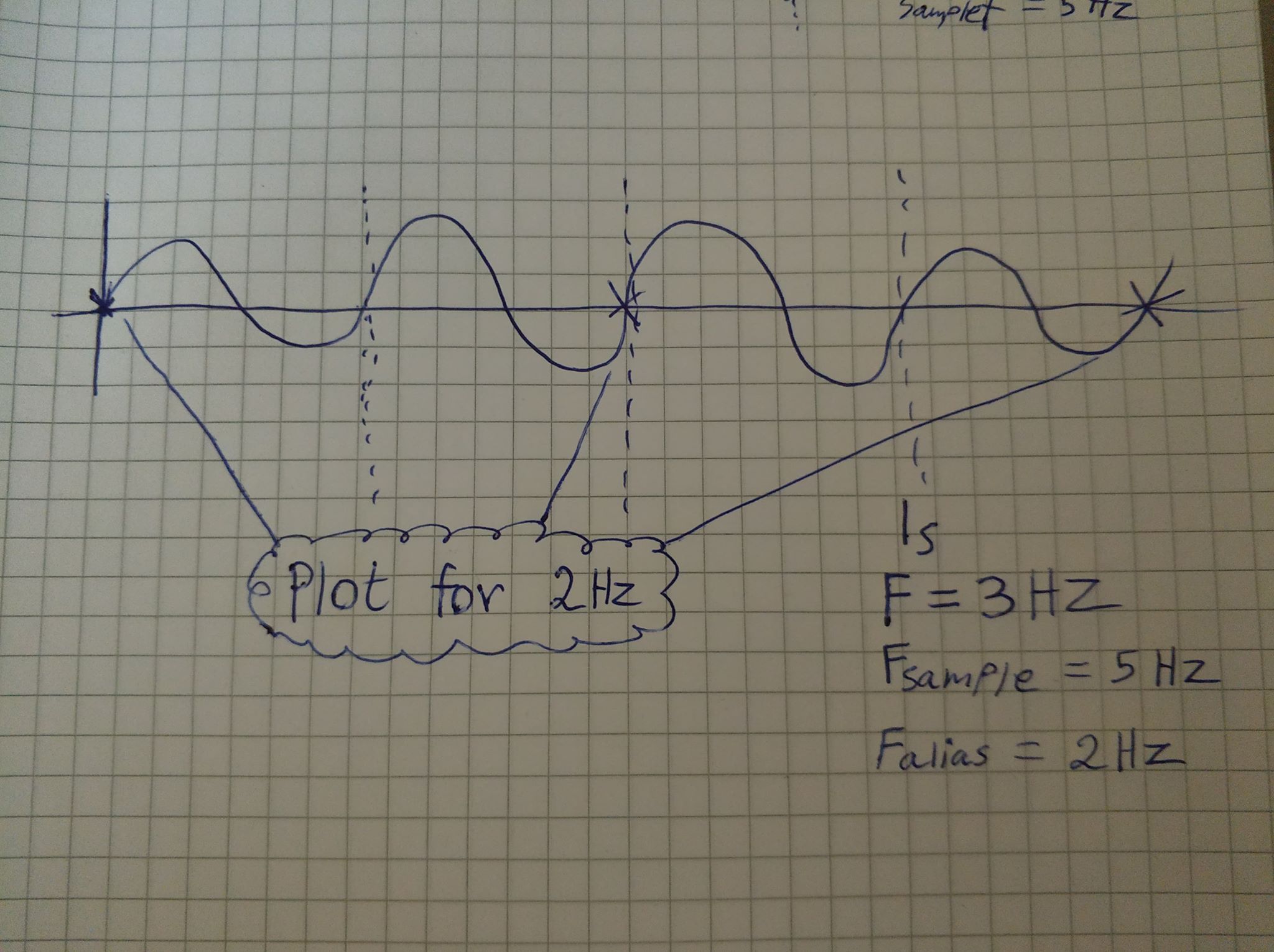
As mentioned in the comments to the question, the sampled points will be those points where 2Hz and 3Hz sinusoids will cross each other.
Wikipedia article for aliasing has the figure you seek; but not for 3Hz and 2 Hz.
Link to figure The even have code for producing the figure it seems.
Another figure
Here is one I made with Octave. Initially it surprised me that the sampled points were NOT the points where the graphs were crossing each other. Then I realised that for the 2,3,5 combination, the negative frequency is getting aliased. So below you will find two sets of figures where 3Hz and 2Hz are plotted together and another set where 2Hz and negated 3Hz sinusoids are plotted together.

Octave code for producing this figure.
clear;

% a time vector with much much higher sampling frequency
% to represent the original continuous time signal.
time = [0 : 0.02 : 2]';

s3 = (-1) * sin(3*2*pi*time);
s2 = sin(2*2*pi*time);

% produces logical one at time period corresponding to 5Hz frequency
sample = abs(rem(time, 1/5))< 100*eps;

subplot(2,1,1);
% continuous time signal
plot(time, [s2,s3]);
hold on;

% samples
plot(time(sample), s2(sample), 'x', time(sample), s3(sample), '+');

legend('2Hz', '3Hz', '2Hz sampled', '3Hz sampled');
xlabel('time (s)');

subplot(2,1,2);
stem(time, sample);
legend('sampler');
xlabel('time (s)');
ylim([-1 2]);


