First, I would point out that you can read additional diode parameters **BV**, **Ibv** and **Cjo** directly from the LED datasheet as "Reverse Current" **Ir** at **Vr** and as "Capacitance" **C**.
---
Adding to W5VO's great answer, I somewhat streamlined the process for myself the following way:
1. I used the chart type of **XY scatter plot** as **lines only** on OpenOffice (YMMV with Excel, etc.) and set the minima and maxima of the axes manually, e.g. (X,Y)=(1.4-4.0, 0.01-50.0), to pervent it from autoranging to outside the scope of my sampled data.
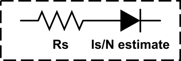
2. After the first three columns of sampled points **Vf_sampled**, **If_sampled** as well as the **If_estimate** using the Schokley diode equation, I added a *fourth* one for a calculated **Vf_estimate**. Remember, that **Rs** is a *series* resistance (see image at the bottom) and the **If_estimate** actually gives us the current to use here, so one can simply calculate the column cells as:<br> **Vf_estimate = Vf_sampled + (If_estimate * Rs)**.
3. I could now add a third curve, in which I used the new fourth column (**Vf_estimate**) **as the X coordinate** and the third column (**If_estimate**) as the Y coordinate, and which I could now easily match against the first curve (the data sampled from the graph on the datasheet). Note that I didn't want to simply replace the second curve since the straight line was quite helpful in my estimates.
4. I'm sure I'm somewhat repeating W5VO here, but it bares reminding of the role of the constants **Is**, **Rs** and **N** in terms of the curve shape (in our *log-lin* scale):
- **Is** only affects the position of the curves (up/left or down/right).
- **N** affects the curve slopes **as well as** the positions (since it's a linear coefficient and the curves always go through the origin, which is always outside the scale).
- **Rs** defines the curvature (the progressive rightward sweep) of the new third curve (since it's a linear term in the other direction).
5. Things I found that may be of use:
- You may find that the second curve (the straight line) needs to be very slightly steeper and to the up/left than it would seem from the sampled data, because the curvature due to **Rs** starts at the origin.
- You can get fairly accurate sampling by zooming in to the datasheet (assuming PDF), taking a screencap and opening it in your favourite drawing program. You can then use e.g. the selection or straight-line tool to measure the distance in pixels between the interval lines and the distance of the point to the lower-value interval line. For linear axes, that fraction translates to easy data values.
- XY scatter plot allows you to use arbitrary points of data. You can get away with less samples than with equidistant sampling. You can choose to only sample the data at the points where it is easiest and where strictly needed. For example, on a semilog scale you can sample at the interval lines of the logarithmic scale. If you need to, you can still have more points (rows) for the estimated curves. (At least OpenOffice charts seem to ignore the points for which there is no corresponding Y-coordinate.)<br>Note that the X values (**Vf_sampled**) still need to be in ascending (or descending) order. Otherwise the lines become a mess.
- Note the scale of the units you are estimating/charting/trying to find (e.g. milliamperes) and remember that SPICE generally uses the bare units (amperes).
- Note that W5VO's **Vt** is in *milli*volts. If you're using volts, use the value **0.026**.
- Check which metric prefixes (m, p, u, etc.) your SPICE simulator accepts. Using the exponent notation (e.g. 12E-34) may be simpler.
- Editing the cell range for the chart seemed to always reset the (new) third curve so that I had to re-add the data range to X-coordinates and re-change the third column as its Y range. Take that into consideration when adding more points or modeling multiple LEDs on the same chart - make such changes all at once. (Changing the data within the cells obviously didn't trigger the reset.)
- Curved interpolation on the chart may lead you astray by overshooting or undershooting and not showing you why i.e. where the actual points of data are.
- Straight line segments may also mislead, since the corresponding points end up in different locations and the linear interpolation doesn't track the logarithmic nature of the curve. (All the points of data of the sampled curve and the new third curve should be outside (up/left) of the straight line segments of the other.)
---
AFAIK, our model for the LED is essentially an **Rs** resistor and **Is**/**N** estimate diode in series: (-R->-D-)
<!-- Begin schematic: In order to preserve an editable schematic, please
don't edit this section directly.
Click the "edit" link below the image in the preview instead. -->

<!-- End schematic -->