I'm supposed to apply a Clarke-Park transformation to an electrical signal so other people at my office can study the "quality" (?) of said signal.
I was given a Jupyter Notebook replicating the tutorial from here, which is pretty much this:
import ClarkePark
import numpy as np
import matplotlib.pyplot as plt

end_time = 3/float(60)
step_size = end_time/(1000)
delta=0
t = np.arange(0,end_time,step_size)
wt = 2*np.pi*float(60)*t

rad_angA = float(0)*np.pi/180
rad_angB = float(240)*np.pi/180
rad_angC = float(120)*np.pi/180

A = (np.sqrt(2)*float(127))*np.sin(wt+rad_angA)
B = (np.sqrt(2)*float(127))*np.sin(wt+rad_angB)
C = (np.sqrt(2)*float(127))*np.sin(wt+rad_angC)

d, q, z = ClarkePark.abc_to_dq0(A, B, C, wt, delta)
A,B and C are generated using the np.sin() function and the wt array, which is an evenly-spaced time list whose elements have been multiplied by 2 * pi * 60, and they look like this:
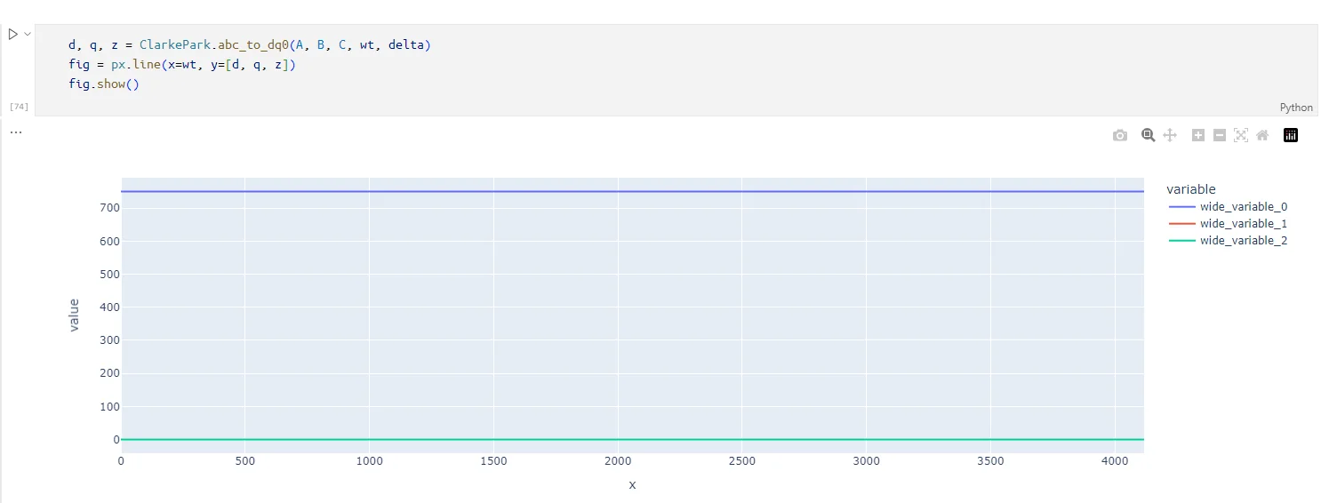
The DQ0 transform of said signal looks like this:
However, when I apply that transformation to my signals, read by a PLC connected to an actual electricity generator (a solar panel in this case I think) looks a bit less perfect.
This is my source signal (head of a DataFrame, resulted from reading three txt files holding the values for Time and each component of the signal, R, S and T):
    Time        IESTR       IESTS       IESTT
0   0.000167    584.00769   -786.99103  171.411900
1   0.000250    587.18536   -764.24414  150.228470
2   0.000333    590.26617   -742.32513  123.431180
3   0.000417    631.94775   -770.98303  102.068790
4   0.000500    640.10138   -754.37830  84.461655
Notice how lines a bit more "jerky" than the generated ones:
When I try to transform those signals to the DQ0 space, I get something that looks mainly as an alpha beta transform.
Any help on why the Clarke-Parke transform doesn't look like it's supposed to?


