Why does graphical representation of a DC source always a straight line?


Why does graphical representation of a DC source always a straight line?


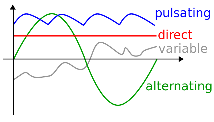
Because its value doesn't change over time, that is, it can be written as a constant function. Its graph is, as you'd expect... a straight line.

[This started as a comment, then it ran out of space.]
The drawing in the O.P. probably comes from the Wikipedia article for DC. The drawing looks watered down [oversimplified]. For starters, the axes aren't labeled. Also, what is "variable" gray trace supposed to mean? Aren't green and and blue traces variable too? They aren't constant for sure.
More importantly, there are 2 definitions of DC, and the drawing doesn't reflect this.
In the engineering practice, it's usually apparent from the context, which definition is implied. For example: "DC bias" implies the 1st definition, "DC sensor output" implies the 2nd definition.
Actually, every DC voltage is nothing but an AC voltage with zero frequency.
\$ V_{DC} = V_{PEAK} \times \sin(2\pi\omega t + \theta) \big|_{\omega=0} = V_{PEAK} \times \sin(\theta); \\ \quad \text{where} \; V_{PEAK} \text{ and } \theta \text{ are fixed parameters.} \$
Its frequency is zero, so it is not fixed, not changing in time. In other words, it is a fixed value function. That's why its representation is a straight line.